Announcement

Collapse
No announcement yet.

Pic of the Day

Collapse
This is a sticky topic.
X
X
 
  • Filter
  • Time
  • Show
Clear All
new posts

  • Perhaps slightly over exposed?

    Rawr

    Comment


    • Originally posted by Jasper Ash View Post
      I'm going to spend a lot of time on this thread. Some great shots on here. Daved3sign, I would be greatful if you would so kindly PM me how you get that color tone/PP used in that photo quoted above. I've always loved it.

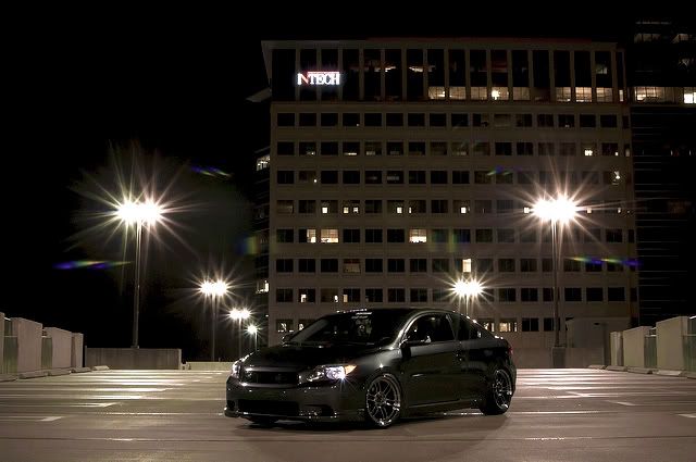
      Heres a shot I took of the whip tonight.
      Mess around with some adjustment layers, play with curves, levels, color balance, you'll produce something you like pretty quickly.
      - Kielan (Key-lin)

      Comment


      • Thanks! ^
        WFC#293 | flickr | Vimeo | DailyDetergent.com

        PM me for photo shoots in South Florida!

        Comment


        • Originally posted by Jasper Ash View Post
          Thanks! ^
          i tried a bit, i just couldnt do much because it was so dark to begin with, and im not a pro at photoshop.

          Comment


          • I Got A New Job
            sigpic

            Comment


            • Comment


              • Comment


                • Froth

                  Comment


                  • Low.slow.celi, that edit came out great. Nice. Going to hop onto PS now.
                    WFC#293 | flickr | Vimeo | DailyDetergent.com

                    PM me for photo shoots in South Florida!

                    Comment


                    • Agreed^ Amazing what you can do with that program. I wish I had it and knew how to use it. I feel like a lot of the shots I take could be salvaged if I did. All I can do is the very limiting amount in flickr. Anyone have any cheaper program then photoshop they would recommended?

                      Comment


                      • Couch Potato
                        sigpic

                        Comment


                        • Some meet I ran into on my way to the fair. I decided to take a couple shots.


                          56' Big Back Glass Chevy
                          08' Audi S5

                          Comment


                          • Mr Ganja, I think your editing is slightly too strong.

                            Might just be a personal thing.
                            sigpic

                            Comment


                            • I'd agree with that, the processing is a bit much for me. Also the framing seems a bit off, it works well in the 3rd one, but the 1st, your missing just a little bit of the car, so it seems mis framed, and the 2nd, it would work better if you could see more of the bumper bar in the bottom of the shot, and if you had moved slightly right some more so the headlight wasnt in view.
                              www.brassmunkymedia.com.au


                              Oversteer Scares The Passengers, Understeer Scares The Driver

                              Comment


                              • sigpic

                                Comment

                                Working...
                                X