Announcement

Collapse
No announcement yet.

what do you guys think?

Collapse
X
 
  • Filter
  • Time
  • Show
Clear All
new posts

  • what do you guys think?

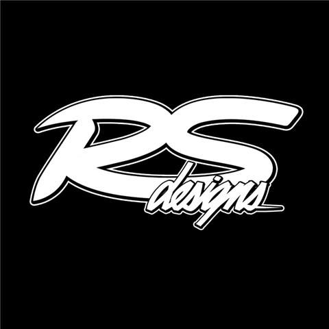
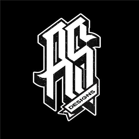
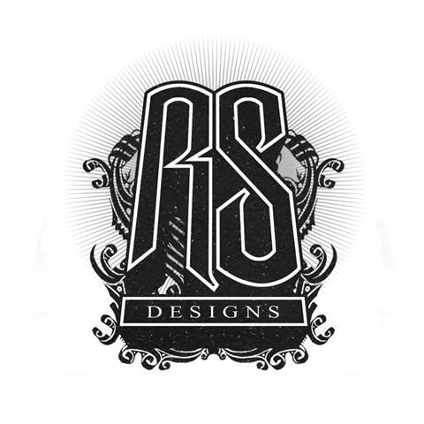
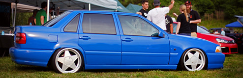
    I had a good friend design a couple different logo's for my up and coming business adventure. logo 2 is cool but just don't feel like i would use it for anything so what I am thinking is logo 1 for the main design (website header, stickers, shirts, hats, plaques for cages and custom stuff) we need to do some more tweaking on logo 1 just to make it more refined and perfect and as far as logo 3 goes, I really enjoy this logo but it is very detail oriented so I am thinking about using this logo for shirts, some stickers, and just misc stuff. I actually got some shirts for xmas and they turned out awesome, but just wanted to see what you guys thought and any changes you would make

    1.


    2.


    3.


    First batch of shirts

    Ryan

  • #2
    I can't wait to be able to work with Mike and this forum as soon as I get everything rolling. Again thanks for all the input in advance guys!!
    Ryan

    Comment


    • #3
      I really dig #3 but it's a little detailed for a logo.. what about a non-text based secondary logo?
      Ben Purkiss Design
      My Design Blog

      Comment


      • #4
        I say go with 2, much easier for vinyl production so you can sticker up all those F-body's and SHO's you guys work on.

        Comment


        • #5
          IMO Logo 2 is too hard to read. Logo 1 is good and might look cool to have the "designs" text as negative space inside the other letters where the ligature is connecting them slightly balanced to the right. I dig logo 3 but its a t-shirt design more so than a logo.
          If you can't scale it down to 1" and still read it then it's probably not a good choice for your logo.

          Comment


          • #6
            Logo 2 is my favorite.
            Originally posted by da3bous
            I want you to photoshop a giant penis down the side of my car

            Comment


            • #7
              #3

              Comment


              • #8
                U basically answered what I thought. Logo 1 for main and logo 3 for tshirts

                Comment


                • #9
                  I think logo 3 has the best potential...

                  I think without the swirls and such the logo could be easily created from vinyl for stickers, and in general without the swirlies it can look much cleaner...

                  Since I said it, make it happen
                  iiililillillliliil
                  bar|society

                  Comment


                  • #10
                    #3 Ryan. Let me know when you get some stickers or something made and i'll throw one on my car

                    Comment


                    • #11
                      I personally like #2... I think its the best designed out of all of them. It's a good "bug", usable by itself without any aid. Its not a run-of-the-mill logo.
                      I personally think that #1, while it does look good, and is very legible, seems to be something I'd have seen on the side of an early 90's RC off-road truck... in day-glow yellow.

                      Comment


                      • #12
                        Mmmm i think 1 or 3 look the better
                        Live,Breathe,Build,Believe,BMW!

                        Comment


                        • #13
                          Originally posted by M.Burroughs View Post
                          I personally think that #1, while it does look good, and is very legible, seems to be something I'd have seen on the side of an early 90's RC off-road truck... in day-glow yellow.
                          This.

                          I like 3 the best. I don't think it would take much tweaking to make a sticker-version of that one as well that isn't as involved.
                          -Darrick

                          Frankenbike Build Thread
                          Another Frankenbike Build

                          sigpic

                          Comment


                          • #14
                            Originally posted by Capt. Obvious View Post
                            This.

                            I like 3 the best. I don't think it would take much tweaking to make a sticker-version of that one as well that isn't as involved.
                            This is pretty much where i'm at, with it as well...
                            If anything no swirlies like tivs said for stickers. Like Matt said, #1 looks like something off early 90s RCs, lol.

                            Comment


                            • #15
                              I personally like #2, like Mike I think that #1 looks like an old RC car, (was thinking that when I saw it) and #2 just has a good vibe. Like #3 but I get the feeling of the Asanti Wheels logo for some reason. So my vote is #2

                              Contact me if you are interested in DPE Wheels edafe@dpe-wheels.com

                              Comment

                              Working...
                              X