Announcement
Collapse
No announcement yet.
The Douche-Themed Snowmobile
Collapse
X
-
Haha thanks man. I'm feeling like it's gonna be better than the STI. At least in my opinion lol
-
Well damn, The car was looking really good man! I am betting the E30 will look just as fresh
Leave a comment:
-
Haha no, it's not. I'm still going to drive it every day, just stock. I have a 1992 E30 convertible that I'm going to lower next.
Leave a comment:
-
Yeah it was, I got behind some people going 18mph in a 35 when the road was just wet. I raged a little.
Also, I'm parting out this car and it's going to be stock for a while, so that's the end of this build thread. Thanks guys who showed me support and all the good words. I'll be working on my E30 for a little while once I get all the parts sold.
also, if by any chance you want anything, PM me. Thanks.
Leave a comment:
-
Dude the fucking ice was horrible, people don't know how to drive in it.
Leave a comment:
-
Oh cool. Thanks, I appreciate that a lot. I'll try on my own first and if I can't figure it out, I'll let you know.
Leave a comment:
-
Im a graphic designer by trade so let me know if you need any help and Ill do what I can for you... the changes would only take a minute or two for someone who knows what they are doing. Happy to help.
Leave a comment:
-
Ah okay cool. I actually didn't make the logo, the guy who started the blog sent it to me in a .pdf file and I had to get it into the photo, which, as a photoshop newbie, was not easy at all. I've figured it out now, as far as how to get it into photos easily, and I have an idea on how to fix what you said. I agree. Thanks!Originally posted by tristinGrind View PostI wanted to chime in a bit since you asked for opinions... I would move the bottom line up closer to the bottom of the first. I think theres too much negative space between the The Society logo and the credit. Try moving it up and sizing it so that each section fits in between all the descenders. Just a thought.
Car looks great BTW.
Leave a comment:
-
I wanted to chime in a bit since you asked for opinions... I would move the bottom line up closer to the bottom of the first. I think theres too much negative space between the The Society logo and the credit. Try moving it up and sizing it so that each section fits in between all the descenders. Just a thought.Originally posted by kevinc View PostFeel free to tell me it all sucks! haha
Car looks great BTW.
Leave a comment:
-
Haha I'm not sure what that means exactly, but I'm gonna say thanks!Originally posted by rsingh3g View Post your pics are getting as good as my sig
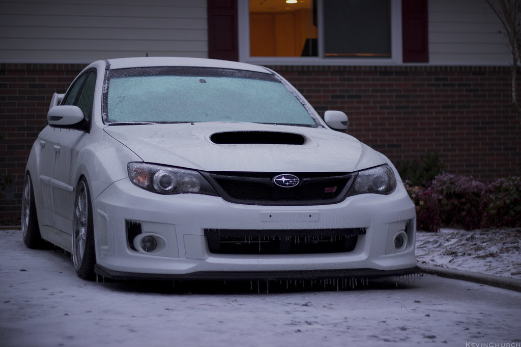
It never snowed. There's just fucking ice everywhere.

STI - Iced over by Kevin_Church, on Flickr
Leave a comment:

Leave a comment: